The cinematic landing page — why Apple-grade design works for Malaysian SMEs, and how to actually build one
Cinematic landing pages used to mean Webflow agencies, RM 30,000+ budgets and 8-week timelines. We build them in 48 hours for RM 399. Here is what 'cinematic' really means and why it converts.
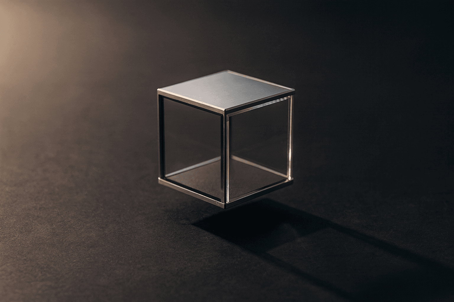
"Cinematic" became the buzzword of premium web design around 2022, when Apple's product pages and a wave of Webflow agency sites raised the visual bar everyone now measures against. Stripe's marketing site. Linear's homepage. Nothing's product launches. The visual language is recognisable: full-bleed hero photography or product renders, generous whitespace, large refined typography, scroll-tied animations that feel inevitable rather than gimmicky.
For Malaysian SMEs, this was a closed door for a long time. A site built to that standard typically cost RM 25,000 - RM 60,000, took 8 - 12 weeks, and required a designer + developer + project manager triangle that most agencies struggled to staff.
Wiz Studio Labs exists in part to crack that price/timeline ceiling. We ship cinematic-grade landing pages in 48 hours for RM 399/year. This article explains what "cinematic" actually means as a set of design choices (not vibes), why it converts for SMEs in 2026, and how the production pipeline that makes it affordable works.
What "cinematic" means as concrete design choices
When designers say a page is "cinematic," they usually mean some combination of these specific decisions:
1. Full-bleed hero photography or render
The first visual element fills the viewport edge-to-edge. No header-with-stock-banner sitting in a content column. No carousel slider. The visual carries weight by itself and frames the rest of the page.
For SMEs, this means a real hero asset — your founder photo, your actual workspace, your product. Stock photography of generic "business handshake" or "happy team" wrecks the cinematic effect immediately.
2. Generous vertical rhythm
Cinematic pages breathe. Sections are tall, often 100vh or close. Padding between elements is large (think 80-160px between major sections, not 40px). The eye gets time to settle on each idea before the next arrives.
The opposite — densely packed sections with 16px gaps everywhere — feels "cheap" even when individual elements are well-designed.
3. Large refined typography
Cinematic typography uses display sizes for headers (typically 56px-96px desktop, scaling appropriately on mobile), tight letter-spacing on display weights, and a clear hierarchy down to body (16-18px line-height 1.5+).
Font choices that read cinematic in 2026: Inter Display, Söhne, Inter, GT America, Söhne Mono, Suisse Int'l. Free open-source equivalents that hold up: Inter (Google Fonts), JetBrains Mono, Geist (Vercel's open release).
What does NOT read cinematic: Helvetica (overused), Times New Roman (web-1.0), default system fonts on mismatched weights.
4. Scroll-tied micro-animations (with restraint)
The hardest part to get right. Done well: elements slide up, fade in, or scale slightly as they enter the viewport. The animation is short (0.4-0.7s), eased smoothly (expo.out or power3.out), and stops after the entrance — no continuous bobbing, no parallax scroll-fighting.
Done badly: heavy parallax that makes scrolling feel sticky, pinned sections that hold the page hostage, every element animating independently in a chaos of motion.
Our internal rule on Wiz sites (from feedback_scroll_jerky_fix.md in our learnings): expo.out, y:32, duration:0.7s, start:'top 95%', once + overwrite. One-shot reveal on viewport entry. No pin-and-scrub on hero or narrative sections.
5. Restrained colour palette
Cinematic pages typically run on a 3-color palette: a dominant near-neutral (warm off-white or cool dark gray), a secondary surface tone for sections, and a single accent color used sparingly for CTAs and highlights.
The opposite — 7 brand colors spread across every element with gradients and decorative shapes — reads "designed by committee."
For SMEs the right pattern is often: a near-white background, a deep navy or charcoal for primary text, and ONE brand accent. Sometimes a sand or warm gray secondary surface. That is enough.
6. Real photography, used sparingly
A cinematic SME page typically has 2-4 hero-grade real photos placed strategically: above the fold, in the founder/team section, in a "process" or "result" section. Not 30 photos. Not a portfolio grid with 24 thumbnails.
This is the inverse of the typical Malaysian SME site that crams 12 stock-photos into 600 vertical pixels.
7. Honest, confident copy
Cinematic design is wasted on weak copy. The pattern that fits is short, specific, confident sentences. Not "We are committed to providing the highest quality solutions for our customers." Instead: "We file customs declarations in 2-4 hours. Most forwarders take 24-48."
The visual confidence of cinematic design demands matching verbal confidence.
Why this converts for Malaysian SMEs in 2026
The argument that "cinematic design is for tech companies, not for local businesses" is wrong in 2026. Three reasons.
1. Mobile design quality has compounded.
75% of Malaysian SME website traffic is mobile. The bar for what "looks legitimate" on a phone has risen dramatically — buyers are comparing your site to Foodpanda's app, to Shopee's product pages, to whatever they used on their last commercial transaction. The 2017-era WordPress-template-with-stock-banner sites no longer pass the legitimacy test.
2. Trust is the bottleneck for high-ticket SME purchases.
Renovation, accounting engagement, dental implants, legal services, B2B contracts — these are 4-6 figure decisions made over multiple visits. The site is doing the trust-closing work between visits. A cinematic site signals "professional, established, takes itself seriously." A 2017 template signals "this is a side business or the website is neglected." Buyers extrapolate.
3. AI-generated answers cite the better-looking sources.
This is genuinely new in 2026. When ChatGPT or Perplexity surfaces a Malaysian SME in an answer, the user clicks through to evaluate. If the destination is a 2017 carousel-slider site, the AI's recommendation gets discounted. If it is a clean cinematic landing page, the recommendation gets reinforced. We covered this in GEO vs SEO.
What kills cinematic design (the failure modes)
Working on 100+ SME sites surfaces a few specific failure patterns that take a site from cinematic to amateurish:
Stock photography of generic business scenes
A handshake, a multi-ethnic team smiling at a laptop, a person presenting in a meeting room. These photos are stock-image-library standards because they are bland enough to fit anywhere — and that is exactly why they break cinematic design. Use real photography of your real business, even if it is phone-quality.
Carousel sliders
A homepage hero that auto-rotates through 3-5 banner slides. This was the dominant 2010-2017 pattern. It still appears on 50%+ of Malaysian SME sites. It signals "old" instantly. The fix: one strong hero, one strong message.
Logo grids of "trusted by" companies the visitor has never heard of
If the logos are companies the visitor recognises (Maxis, Petronas, Maybank, AirAsia) — by all means show them. If they are random SME logos the visitor has no relationship with, the grid adds clutter without trust.
Too many CTAs
Cinematic design typically has ONE primary CTA repeated through the page. Maybe one secondary. SME templates often show 5-7 different CTAs ("Get a quote," "Contact us," "Request a demo," "Subscribe to newsletter," "Download brochure," "Follow us") competing for attention. Pick one primary action. Repeat it.
Heavy parallax and pinned sections
Animation should serve the content, not test the user. Pinning a hero so the user must scroll five "screens" of forced animation before reaching real content is a 2020-era trick that creates a "scroll fight" feeling on modern phones. The right answer is one-shot reveal animations on viewport entry.
Multi-language toggles that hide content
If your business genuinely serves a multilingual customer base, do the work — fully translate the site. A half-translated site or a "translate this page" widget feels worse than picking one language and committing to it.
A "blog" with three posts from 2019
An abandoned blog signals neglect more strongly than no blog at all. If you cannot commit to consistent publishing, remove the section entirely. Empty rooms feel worse than no rooms.
How we make cinematic affordable at Wiz
The reason cinematic landing pages were RM 30,000 affairs at agencies for so long is the design+development separation. A designer would spend 3-4 weeks in Figma producing layouts and assets. A developer would then spend 4-6 weeks translating Figma into a custom WordPress or Webflow build. Project management on top, accounting, repeat revision cycles, the whole stack.
The Wiz model collapses this. We use:
Template families, not blank canvases
We maintain ~6 cinematic template families (Apex, Atelier, Prism, Atlas, Studio, Halo), each pre-tuned for specific service-business categories. The customer brief routes to the right template; we customise content + assets + brand voice within the template, not start from a blank Figma file.
This means the design phase is hours, not weeks.
Code, not visual editors
We build on Next.js + Tailwind + GSAP, not Webflow or WordPress. This is faster for our small team (engineering-trained operators can ship a site in a day) and produces lighter, faster, more SEO/GEO-friendly output than a Webflow export.
AI-assisted asset pipeline
Hero photography is the cinematic make-or-break. For customers who do not have professional photography, we generate cinematic-grade hero images via gpt-image-1 (OpenAI) or BFL Flux 2 Pro — specifically NOT for human portraits (covered in feedback_ai_portrait_quality.md), but for environments, products, and conceptual imagery.
The brief specifies the photographic style: "Wide-angle hero shot of a modern dental clinic interior, late afternoon natural light, shallow depth of field, warm wood tones, single dentist in mid-shot working with a patient, shot on Hasselblad H6D." The output is hero-grade and indistinguishable from professional photography for the cinematic-asset use case.
Single operator, not a hand-off chain
One person on our side runs the brief-to-deploy cycle in 48 hours. No designer-to-developer hand-off. No project manager translating between roles. This collapses the timeline AND the cost.
Vercel-hosted, zero ongoing maintenance
Every site deploys to Vercel as a static-or-server-rendered Next.js bundle. No PHP patches. No plugin updates. No security maintenance. The cost structure of the year-1 build extends cleanly into year 2-N.
What you actually get for RM 399
The full breakdown:
- Cinematic landing page (1 page deep on a sub-domain, or full multi-page site on your own domain)
- Custom hero + brand assets, AI-generated or photographed
- Mobile-tested at 375x812 (iPhone 13/14 standard)
- GSAP scroll-entrance animations on every section
- Schema.org structured data for AI engines
- Vercel hosting with SSL included
- One round of edits within the first year (additional edits at modest cost)
- 48-hour turnaround from brief to deploy
What we do NOT include at RM 399: ongoing content marketing, paid ad management, copywriting for blog posts (we provide the structural shell and one home-page worth of copy; additional pages are scoped separately), professional photography (we use AI-generated or your existing photos), SEO/GEO consulting hours beyond the initial implementation.
Everything that needs to be done to make the site live and converting from day 1 is included. Everything optional sits outside the base price.
Where this fits
If you are a Malaysian SME currently running a 2017-era WordPress carousel site with a Wix or Wordpress.com tagline in your footer, the upgrade is one of the highest-ROI moves available. Cinematic design is no longer the privilege of agency-budget brands — it is the table-stakes baseline for any business that wants to look serious in 2026.
Browse our templates to see the cinematic style across six template families. Start a brief and we will deploy in 48 hours. RM 399/year, unlimited self-serve edits included, Vercel hosting included.
About the author

Dan Duar
Founder, Wiz Studio Labs · Director, DNE Forwarding
Writes The Wiz Journal on websites, SEO, and digital growth for Malaysian SME owners. Previously a senior data analyst at Grab and a tech consultant at EY. BNI Integrity Shah Alam member.
Like what you read
Get a Wiz site for RM 399/year.
We build it free in 2-3 days. You see it live before you spend a ringgit. Keep it if it works for your business.
No card · No sales call